

Short answer: An eLearning storyboard is the screen-by-screen blueprint of a course. It essentially sets out the on-screen text, voiceover, visuals, interactions, animation, and accessibility notes for every screen, and typically gets approved before anyone opens an authoring tool.
Below, you can download the exact eLearning storyboard template our instructional designers use on our client projects, plus the content map we plan for every module.
Free Download
Get the eLearning Storyboard Template (Word) + Content Map
The same template our team uses on real client courses, ready to fill in. Inside the kit:
- A step-by-step guide and field-by-field reference
- A blank content map to plan every screen
- A storyboard template with project details, version log, and reusable screen blocks
- A filled sample module, so you can see the level of detail developers need
- A review and sign-off checklist, including accessibility
In This Article
- What is an eLearning storyboard?
- Why storyboard before you build?
- Text-based vs. visual storyboards
- What to include (our template, field by field)
- Plan first with a content map
- eLearning storyboard example
- How to create an eLearning storyboard, step by step
- How to run storyboard reviews and sign-off
- Word vs. PowerPoint vs. Google Docs
- Adapting the template for different course types
- Common storyboarding mistakes
What Is an eLearning Storyboard?
A complete storyboard usually covers, for every screen:
- Purpose and learning objective – why the screen exists and which objective it supports.
- On-screen text – the exact words learners will read.
- Voiceover – the full narration script.
- Visuals and media – layouts, characters, icons, images, and audio.
- Interactions – what the learner clicks, drags, or chooses.
- Animation and programming notes – what appears when, and what triggers the next step.
- Accessibility notes – reading order, captions, alt text, and keyboard access.
Storyboard vs. Content Map vs. Script vs. Prototype
People in the eLearning space often use these terms interchangeably, but each does a different job at a different stage of the eLearning project.
| Document | What it answers | When it’s made |
|---|---|---|
| Content map | Which screens the module needs, which source slide each one comes from, and how each is treated | First, before any writing |
| Storyboard | Exactly what’s on each screen and how it behaves | After the content map is agreed |
| Script | What the narrator says, and nothing else | Pulled from the approved storyboard for voiceover recording |
| Prototype | What the course looks and feels like as a clickable build | After storyboard sign-off |
On our projects, the content map and storyboard work as a pair. The content map settles the structure, so that the storyboard can focus on the detail. You’ll find both in the download above.
Why Storyboard Before You Build?
Here’s what a storyboard does for each eLearning developer or L&D specialist on the project:
- Everyone reviews the same plan – SMEs, stakeholders, and developers comment on one document instead of on constant emails, slide notes, and half-built screens.
- SMEs check content – reviewers can focus on whether the information is accurate and complete without getting distracted by visuals or navigating a draft course.
- Problems surface early – gaps in logic, missing steps, and screens with no clear purpose are easy to spot on paper. In one of our own reviews, a client noticed a module started too abruptly on the learning objectives. So we then added a welcome script in minutes, before any animation was built.
- Developers build instead of guess – when on-screen text, voiceover, animation sequence, and assets are all written down, developers don’t have to invent timing or hunt for missing graphics.
- Scope and budget get clearer – once the screens are listed, you can see which ones need custom animation, voiceover, or interactions, and estimate the actual eLearning build accurately. That estimate is what drives your elearning development costs.
- Voiceover gets recorded once – a locked script means narration is recorded after sign-off, not just re-recorded every time the content changes.
- QA has a checklist – testers compare each built screen against its storyboard block, including the accessibility notes.
The bigger or more interactive the course, the more a storyboard pays off. A short Rise module might only need a light version, while a narrated, animated course with multiple reviewers needs every field in the template. If you’re unsure which Articulate tool fits your course, our guide to articulate elearning compares Storyline and Rise.
Text-Based vs. Visual Storyboards
Most eLearning storyboards only fall into one of two styles – which one likely fits depends on how visual the course is, who’s reviewing it, and how much of the look is already decided.
Text-Based Storyboards
A text-based storyboard is written like a script, usually in Word or Google Docs – each screen is a block of text covering on-screen copy, narration, interactions, and notes for the developer, with little or no visual design.
- Best for: Narrated courses, compliance and policy training, and projects with heavy SME review.
- Pros: Fast to write, easy for SMEs to edit with comments and tracked changes, and simple to version.
- Cons: eLearning developers and reviewers have to picture each screen, so visual problems can show up late.
Visual Storyboards
A visual storyboard shows each screen as a mockup, usually in PowerPoint, Google Slides, or a design tool, with text and notes placed around it or in the speaker notes.
- Best for: Highly visual courses, click-through interactions, software simulations, and stakeholders who actually need to see the eLearning look before approving.
- Pros: Reviewers will see roughly what learners will see, and layout problems may surface early.
- Cons: Slower to create and revise, there’s little room for long voiceover scripts and detailed build notes, and SMEs might tend to comment on design instead of the core content.
Our Approach: Hybrid
Our template takes the best of both storyboard types. It’s text-first, written in Word, so that your SMEs can review and edit it easily. But every screen also includes a sample visual layout, a rough mockup marked “developer’s discretion”. And it shows the intent of the screen without truly locking the designer into a final design.
And in that way, SMEs can focus on accuracy, clients can see where the course is heading, and eLearning developers get both the exact words and a clear picture of what to build.
| Text-based | Visual | Hybrid (our template) | |
|---|---|---|---|
| Format | Word / Google Docs | PowerPoint / Google Slides | Word with a sample mockup per screen |
| Speed to create | Fast | Slow | Moderate |
| SME review | Easy | Harder | Easy |
| Shows the screen | No | Yes | Roughly |
| Room for VO and build notes | Plenty | Limited | Plenty |
| Best for | Script-heavy courses | Visual-first courses | Most custom builds |
What to Include in an eLearning Storyboard (Our Template, Field by Field)
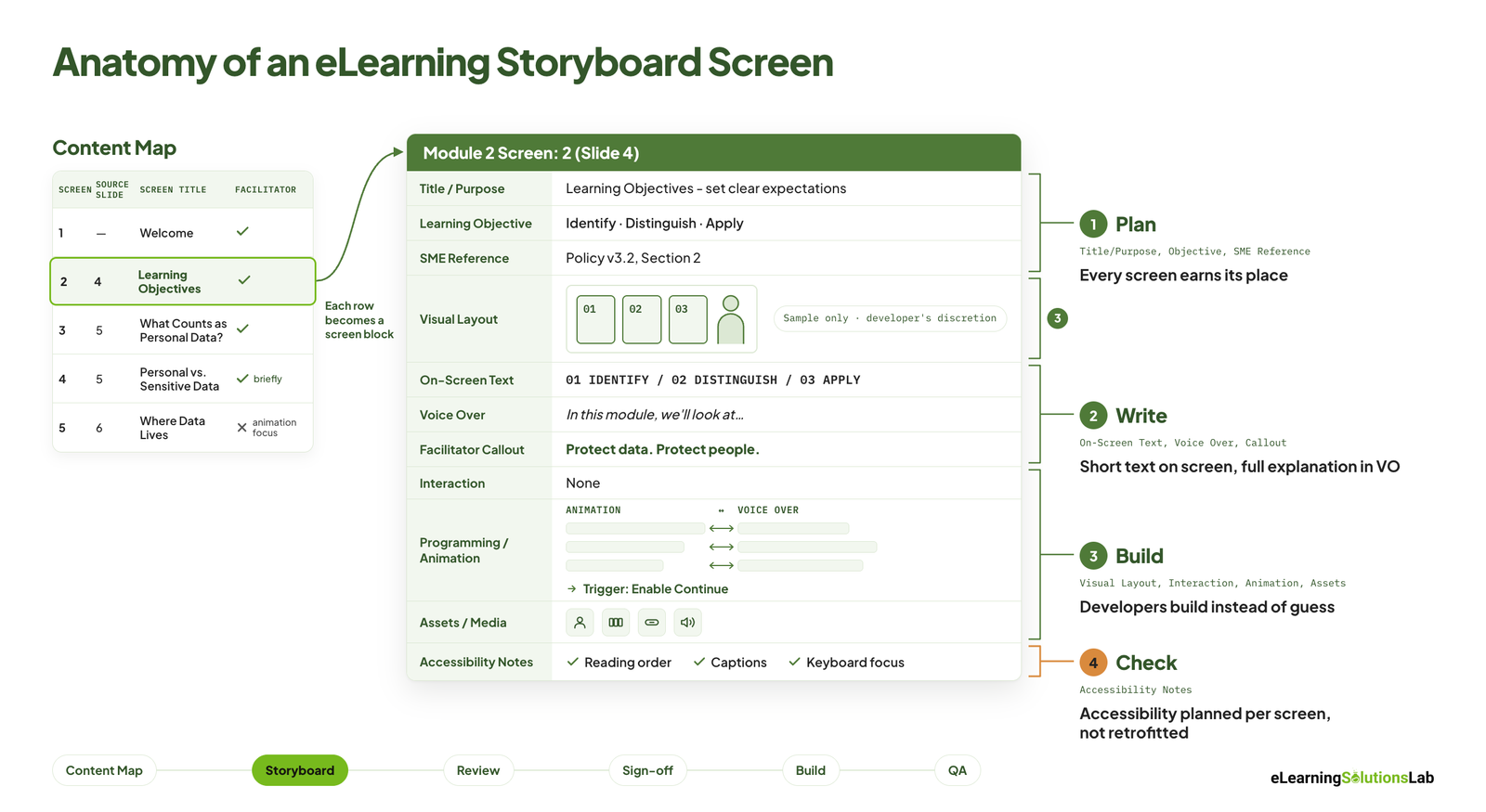
Every screen in our template gets its own block with the same fields in the same order. This will help reviewers always know where to look, and your eLearning developers never have to hunt for information. Here’s the full list, followed by how to fill in each field.
| Field | What goes in it | Filled in by |
|---|---|---|
| Screen header | Module, screen number, and source slide | Instructional designer |
| Title / Purpose | Screen title plus one sentence on why the screen exists | Instructional designer |
| Learning objective | The objective(s) this screen supports | Instructional designer |
| SME reference | The source section the content comes from | Instructional designer |
| Visual layout | A sample mockup, marked “developer’s discretion” | Instructional designer or visual designer |
| On-screen text (OST) | The exact text learners will read | Instructional designer |
| Voiceover (VO) | The full narration script | Instructional designer |
| Facilitator callout | The key line shown with the guide character | Instructional designer |
| Interaction | What the learner does, or “none” | Instructional designer |
| Programming / animation notes | Animation sequence matched to the VO, plus triggers | Instructional designer and developer |
| Assets / media | Everything the developer needs to build the screen | Instructional designer |
| Accessibility notes | Reading order, captions, keyboard access, text alternatives | Instructional designer and QA |
Screen Header and Source Slide
Each block starts with a header like “Module 2 Screen: 1 (Slide 11)”. The screen number shows where it sits in the course, and the slide number points back to the original source deck, so when your SME asks where a point came from, or the source content changes later, you can easily find the matching screen in seconds.
Title, Purpose, and Learning Objective
The purpose is simply one sentence on why the screen exists. For a learning objectives screen, ours reads: “Set clear expectations by introducing the three learning outcomes learners will achieve in this module.” If you can’t write the purpose in one sentence, the screen probably needs to be cut or simply merged.
Below it, you can list the learning objective(s) the screen supports. This will keep every screen tied to what learners need to be able to do, not just what the SME wants to say.
SME Reference
You can name the section of the source material the content comes from. It will make your SME review faster and give you an audit trail if the content is ever questioned.
Visual Layout
We typically add a rough mockup of each screen, labeled “Sample only · Developer’s discretion”. It actually shows the intended layout and mood without locking the designer into a final design, so that your reviewers get a picture of the screen and developers still have room to apply the course’s visual style.
On-Screen Text vs. Voiceover
These two fields are kept separate on purpose – on-screen text should be short and easy to scan:
- 01 – DEFINE the three core concepts
- 02 – DISTINGUISH how they apply at different stages
- 03 – APPLY them to real customer conversations
The voiceover fully carries the explanation in natural, spoken sentences. And if the VO just reads the screen word for word, learners normally switch off – the narration should add context the text doesn’t.
Facilitator Callout
If your course uses a guide character, this field will hold the one key line they display on the screen, such as “Build the foundation for clearer conversations”. It sums up the screen’s takeaway in a single sentence.
Interaction
You can describe exactly what the learner does: click-to-reveal, drag-and-drop, scenario choice, or simply “none”. Writing “none” is useful too, given that it confirms the screen is intentionally passive, not just missing any interaction.
Programming and Animation Notes
Our template uses a two-column table that matches each animation step to the exact voiceover line it plays with:
| Animation sequence | Voiceover |
|---|---|
| Fade in the screen title and the guide character. | “In this module, we’ll focus on three building blocks…” |
| Reveal 01 – DEFINE with its icon. | “By the end, you’ll be able to define what each one means…” |
| Extend the learning-path line to 02 – DISTINGUISH. Reveal the timeline icon. | “…distinguish how they apply at different stages…” |
| Extend the line to 03 – APPLY. Reveal the conversation icon. | “…and apply these principles when talking to customers.” |
| All objectives stay visible. Reveal the facilitator callout. | “These three skills give you the foundation…” |
The block ends with build triggers, such as “Enable Continue button” – these will help eLearning developers not have to guess the timing, and reviewers can check that visuals and narration actually line up.
Assets and Media
You can list everything the screen needs: characters, icons, graphic blocks, buttons, background elements, and audio (for example, “professional VO audio”). This list doubles as the developer’s build checklist and makes asset sourcing easy to estimate.
Accessibility Notes
Every screen includes its own accessibility notes, and our standard checklist covers:
- All key information is presented as text, not only in images.
- Icons support the content but never carry meaning on their own.
- Defined reading order (for example: Title → Objective 1 → Objective 2 → Objective 3 → Callout → Continue).
- Content that can be understood without animation, and everything stays visible once revealed.
- Closed captions for all narration.
- Buttons are keyboard accessible with a visible focus indicator.
Writing these notes during storyboarding costs far less than retrofitting accessibility after the build. Our guide to accessible elearning covers the standards behind each point.
Plan First With a Content Map
Before we write a single screen block, we build a content map: a one-page table listing every screen in the module. It shows the shape of the module at a glance and ties each screen back to its source, which is especially useful when projects start from an existing slide deck.
Our content map uses four columns:
- Screen – the screen number in the course.
- Source slide – where the content comes from. One slide often becomes two or three screens.
- Screen title – the working title for the screen.
- Facilitator treatment – how the guide character is used on that screen.
The facilitator column is the one most templates miss. We decide in advance where the guide character appears, so they support the content instead of talking over every screen:
| Code | Use it when |
|---|---|
| ✅ Introduces concept | The facilitator opens a new idea and sets the context. |
| ✅ (briefly) Introduces | The facilitator makes a short appearance before the content takes over. |
| ❌ Content / animation focus | The facilitator steps back so visuals and animation do the teaching. |
| ✅ Guided practice | The facilitator coaches learners through an activity or final challenge. |
Planning this early also flags which screens need the heavier animation budget, before anyone starts writing. Many of our projects start from existing slide decks, and our convert powerpoint to elearning services follow exactly this process: map the slides first, then storyboard.
eLearning Storyboard Example
Here’s one screen from the filled sample in our download: the learning objectives screen from a data privacy compliance module. It shows the level of detail a developer needs to build the screen without a follow-up call.
| Field | Sample entry |
|---|---|
| Screen header | Module 2 Screen: 2 (Slide 4) |
| Title / Purpose | Learning Objectives – set clear expectations by introducing the three outcomes learners will achieve in Module 2. |
| Learning objective | Identify personal and sensitive data; distinguish safe from risky handling practices; apply the correct response steps when a data incident occurs. |
| SME reference | Data Privacy Policy v3.2, Section 2: Handling Personal Data |
| On-screen text | What You’ll Learn: 01 – IDENTIFY · 02 – DISTINGUISH · 03 – APPLY |
| Voiceover | “In this module, we’ll look at how to handle personal data safely in your everyday work. By the end, you’ll be able to identify the personal and sensitive data you handle, distinguish safe practices from risky ones, and apply the right steps if something goes wrong.” |
| Facilitator callout | Protect data. Protect people. Protect trust. |
| Interaction | None |
| Animation notes | Fade in title and facilitator, reveal each objective card on its VO line, extend the learning-path line between cards, reveal callout last. Enable Continue button at end of timeline. |
| Assets / media | Facilitator character, three objective cards, learning-path line, callout box, Continue button, professional VO audio and captions |
| Accessibility notes | Objectives presented as text; icons are supporting only; reading order Title → 01 → 02 → 03 → Callout → Continue; closed captions; keyboard-accessible Continue button |
| Review status | SME asked for a welcome screen before the objectives – added as Screen 1. Approved v2. |
The full sample, including the completed content map, is in the free download.
How to Create an eLearning Storyboard, Step by Step
Whether your own team writes the storyboard or you hire elearning designers to do it, the process follows the same steps. It’s also the backbone of how to create effective elearning courses that learners actually finish.
- Gather your source content and confirm learning objectives. Collect slide decks, manuals, and SME notes, then agree on what learners should be able to do by the end. If you need help turning raw material into clear objectives, that’s where instructional design services come in.
- Build the content map. List every screen, link it to its source, and assign the facilitator treatment.
- Write the purpose and on-screen text for each screen. Keep on-screen text short and scannable.
- Write the voiceover. The narration should explain the screen, not repeat it. AI tools can speed up a first draft, but an instructional designer should always edit it – ai for instructional design covers where that line sits.
- Plan interactions and the animation sequence. Match each animation step to its voiceover line.
- List assets and accessibility notes. Add them as you go, not at the end.
- Send it for SME and client review. Reviewers comment directly in the Word file.
- Resolve comments, version the file, and get sign-off. Only locked storyboards move to development.
- Hand off to development and use the storyboard for QA. The developer builds the course and packages it for your LMS – how to create scorm content explains that final step.
How to Run Storyboard Reviews and Sign-Off
A storyboard is only useful if the right people approve it before development starts. A few habits keep reviews fast and predictable:
- Review in comments, not emails. Ask SMEs and stakeholders to comment directly in the storyboard file, so every piece of feedback sits next to the screen it relates to.
- Respond to every comment. In the review mentioned earlier, the client wrote that starting Module 2 on the learning objectives felt abrupt. We replied in the same thread with a new welcome script, and the change was approved before any build work began.
- Limit review rounds. Agree on two or three rounds up front. Every extra round adds time and cost.
- Name one final approver. When several reviewers disagree, one person makes the call.
- Version the file clearly. Use names like M2_Storyboard_v3_APPROVED and keep a short version log, so nobody builds from an outdated draft.
Word vs. PowerPoint vs. Google Docs: Which Format Should You Use?
There’s no single right tool, and the storyboard format doesn’t need to match your authoring tool. Pick the one your reviewers are most comfortable with. (If you’re still choosing an authoring tool, see our roundup of the best elearning authoring tools.)
- Word – best for script-heavy, narrated courses and formal SME review with tracked changes. This is our default.
- PowerPoint or Google Slides – best for visual-first or click-through courses where layout matters more than narration.
- Google Docs – best when several reviewers need to comment at the same time.
Adapting the Template for Different Course Types
Our template covers most narrated, animated courses as-is. For other course types, expand or add a few fields:
| Course type | What to add or change |
|---|---|
| Branching scenarios | Add choice, consequence, and next-screen columns for each decision point. See our scenario based elearning services. |
| Software simulations | Add step-by-step action and hotspot rows for each click. See elearning simulation. |
| Microlearning | Trim each screen to on-screen text, media, and one knowledge check. See our microlearning services. |
| Rapid Rise courses | Replace the animation table with block types (text, accordion, process, quiz). See our rapid elearning services. |
| Multilingual courses | Add a localization notes row for text expansion, culturally neutral visuals, and VO re-recording. See our elearning localization services. |
Common Storyboarding Mistakes
- Voiceover that reads the screen word for word. Learners read faster than narrators speak, so they tune out.
- Screens with no clear purpose. If you can’t explain why a screen exists in one sentence, cut or merge it.
- “Animate this” with no sequence. Developers end up guessing, and reviewers see surprises in the build.
- Leaving accessibility for the end. Retrofitting captions, reading order, and keyboard access costs far more than planning them.
- No source references. Without them, SME feedback is hard to trace and updates take longer.
- Building before sign-off. Every change after development starts costs rework.
For what a well-built course should include beyond the storyboard, see our guide to elearning development best practices.
Want us to storyboard and build it for you?
At eLearning Solutions Lab, our instructional designers write the content map and storyboard, run SME reviews, and deliver a finished, SCORM-ready course that runs in the LMS you already have. Instructional design, development, and QA are handled by one team. Send us your content and we’ll come back with a scope, a price, and a delivery date before you commit to anything.
Related Reading
- Instructional design services – turning raw content into clear objectives and storyboards.
- Hire elearning designers – freelancer, in-house, or development partner.
- Accessible elearning – building courses everyone can use.
- How to create effective elearning courses – the full course design process.
- Convert powerpoint to elearning services – turning slide decks into interactive modules.
- Elearning development costs – what actually drives a content quote.
The Author

Book A Discovery Call
Our Learning Advisors are happy to walk you through your project step-by-step — content, timeline, and fixed pricing.
Get Your Free QuoteNo obligation — just a focused conversation. Proposal within 24 hours.
You may also like
How to Choose an LMS: A 7-Step Guide (With Free Scorecard)
Short answer To choose an LMS, define your goals and learners first, then…
12 Real Microlearning Examples You Can Copy
Short answer A microlearning example is a short lesson, usually 2 to 5…