

Accessible eLearning is online learning that is designed so that everyone can perceive, navigate, and complete it, including people who are blind or low-vision. Deaf or hard of hearing, neurodiverse, or who will navigate by keyboard or screen reader.
Done well, it will also help everyone else: the learner on a noisy commute, the one on a slow connection, and the one who’s working in a second language.
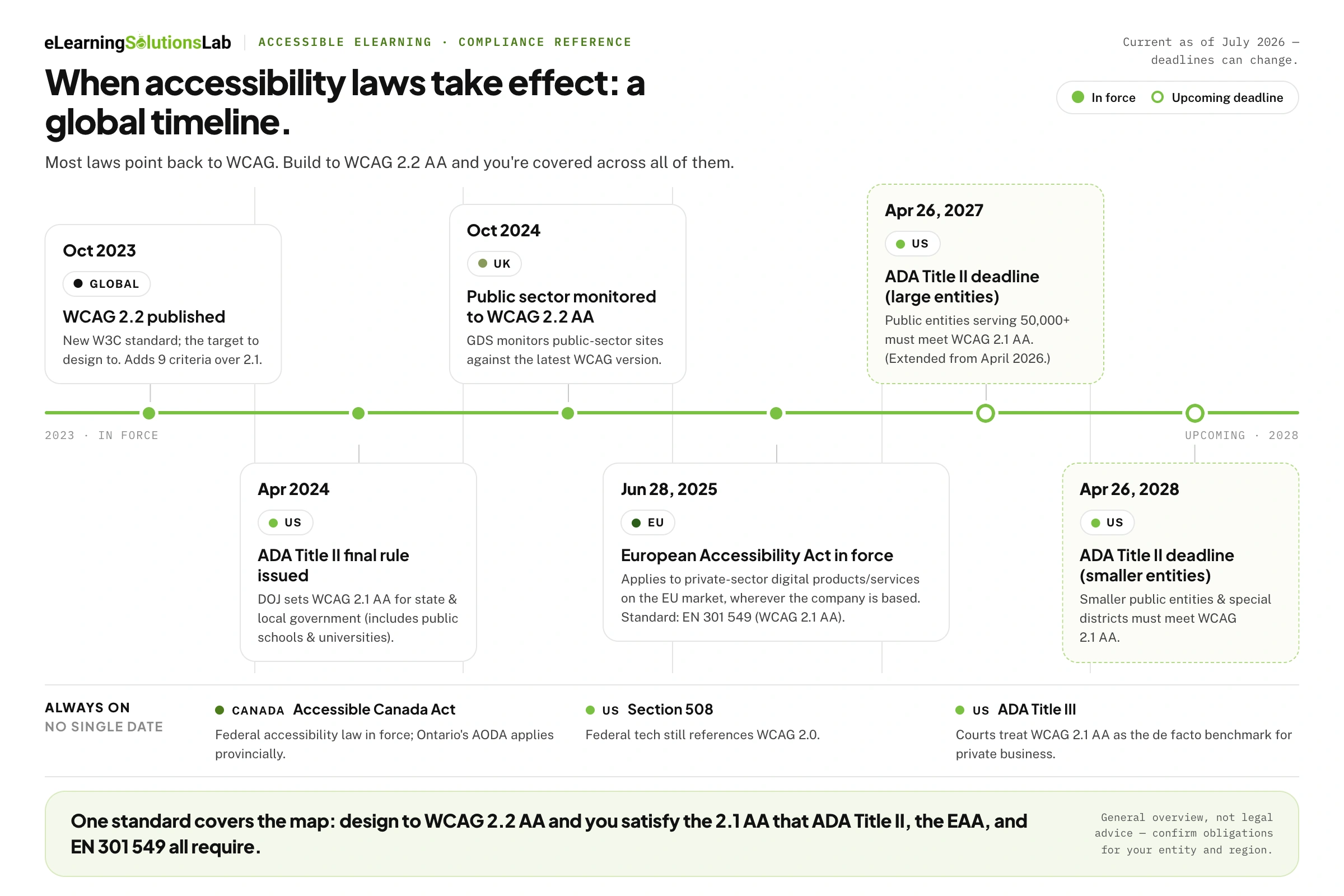
It’s also no longer just optional. With the European Accessibility Act now enforced across the EU and the U.S. Department of Justice’s ADA Title II rule setting firm deadlines, WCAG conformance has really shifted from best practices to legal obligation for a growing share of organizations – wherever their learners will live. The stakes are highest with mandatory training: if your compliance training plan assumes every employee can complete every module, an inaccessible course quietly breaks that assumption for the people least able to flag it.
In this guide, you’ll get fundamentals, a breakdown of WCAG 2.2 and global laws that reference it, step-by-step guidance inside Storyline, Rise, Captivate, and Lectora – the best eLearning authoring tools most teams are already working in – a testing workflow, and a downloadable QA checklist – everything you just need to build courses that actually work for everyone.
Who accessible eLearning is actually for
Accessibility is often just filed under the small percentage of users with disabilities. And that framing is both wrong and strategically limiting. So roughly one in six people worldwide lives with a significant disability, but the real audience here for accessible design is far broader, given that accessibility features will help people in situations, not just people with diagnoses.
You can start with the groups accessibility is genuinely built around:
Visual – learners who are blind and use screen readers, have low vision, and rely on zoom or high contrast, or are colorblind and can’t distinguish a red “incorrect” from a green “correct”. So for them, alt text, logical reading order, contrast, and never using color alone to convey meaning are actual differences between a course they can take and one they can’t.
Auditory – deaf and hard-of-hearing learners who actually need captions and transcripts for any narration, video, or audio-based interaction. Auto-generated captions aren’t just enough on their own – accuracy is the actual requirement. And if the same course ships across regions, caption accuracy belongs inside your eLearning translation services scope rather than in a cleanup pass at the end.
Motor – learners who can’t simply use a mouse and navigate entirely by keyboard, switch device, or voice control. So every interaction, including menus, quiz answers, drag-and-drop next buttons – has to be reachable and operable without a pointer, in a predictable focus order.
Cognitive and neurodiverse – the largest and most overlooked group, including learners with ADHD, dyslexia, autism, memory or processing differences, or anxiety. So they will truly benefit from plain language, consistent navigation, content broken into digestible chunks – the same logic that drives microlearning services — the ability to control pacing, and removal of unnecessary distractions and time pressure.
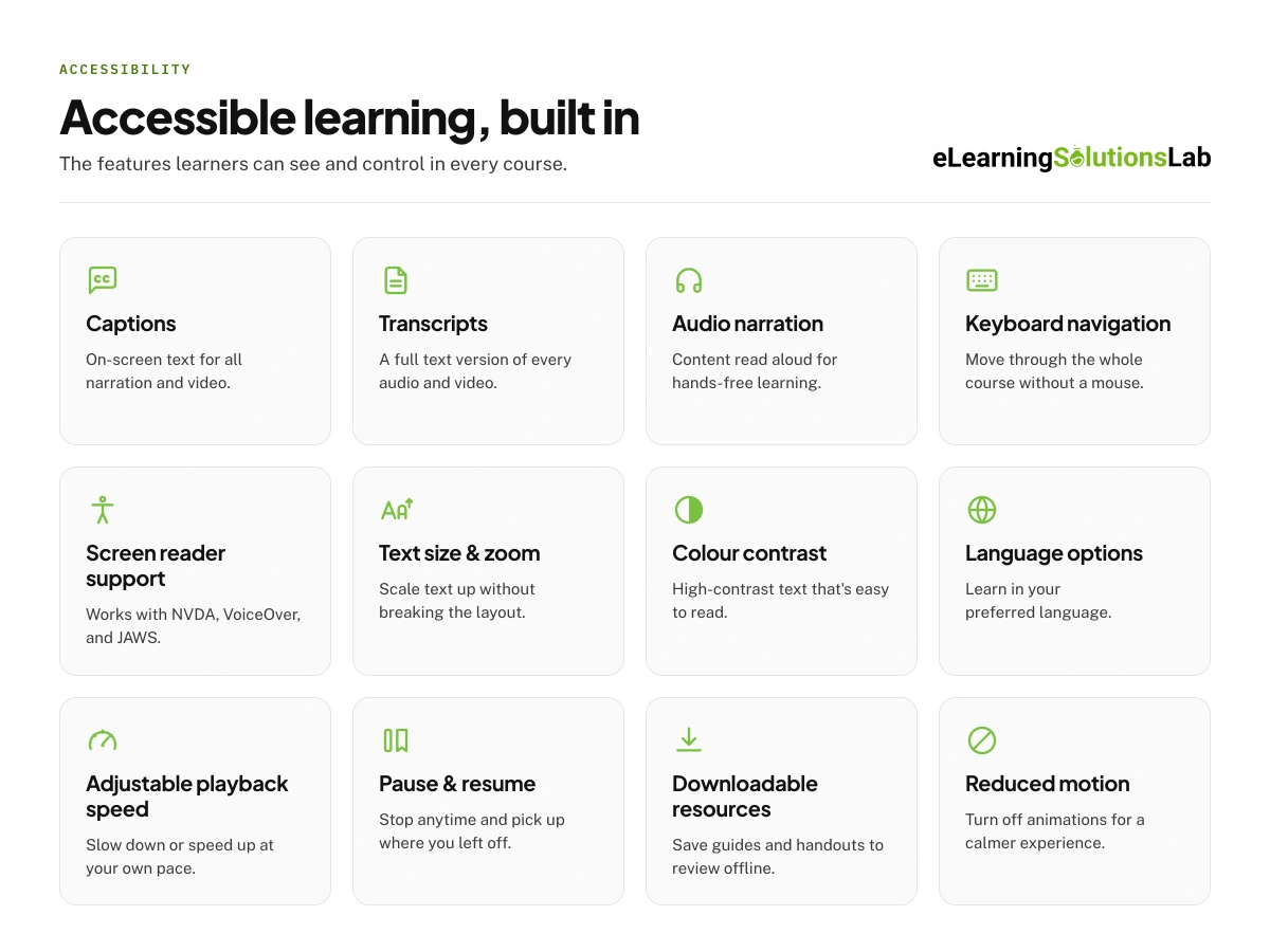 Every one of those features will also serve people with temporary or situational limitations, which, over a year, is nearly everyone:
- Captions that will help the learner taking a module on a silent commute, or in a busy open-plan office without headphones.
- Transcripts and adjustable playback speed will help someone squeezing training into a lunch break.
- High contrast and text zoom to help anyone reading on a phone in bright sunlight.
- Keyboard navigation will help the user whose trackpad just died mid-course.
- Plain language and clear structure will help the learner working in their second language, and where that group is a large share of your audience, eLearning localization services close the remaining gap.
This is one of the core arguments for treating accessibility as design quality rather than just a compliance tax: same choices that will make a course legally compliant, making it measurably better for your entire audience, like higher completion, better comprehension, fewer support tickets, all of which land directly in your eLearning ROI. With this, you’re building for real conditions your whole learner base moves in and out of constantly.
Standards, explained simply: POUR and WCAG.
Almost every accessibility law in the world points back to the same technical rulebook: Web Content Accessibility Guidelines (WCAG), which is actually maintained by the World Wide Web Consortium (W3C). So if you understand WCAG, you’ll understand what “accessible” legally and practically means: for your website, LMS, and your courses.
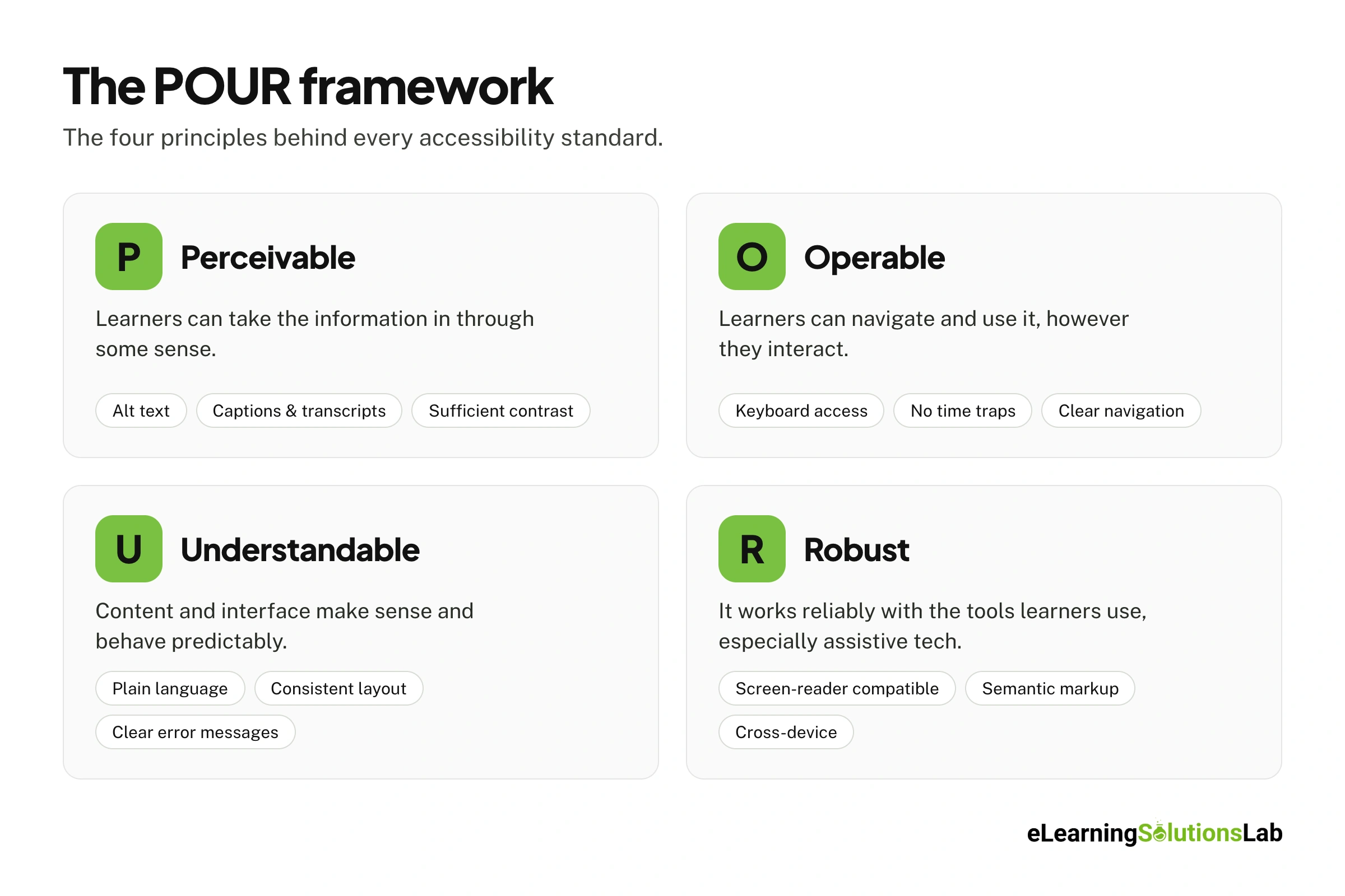 Here’s what it actually means:
POUR: these are four ideas everything hangs on:
WCAG is organized around four principles that are remembered by the acronym POUR. Content must be:
- Perceivable – people will take the information in through some sense. So if a learner can’t see it, can they actually hear it or read it another way? – elements like alt text, captions, transcripts, good contrast.
- Operable – people will actually use and navigate it, whatever decision they can use to do so (keyboard access, no time traps, clear navigation).
- Understandable – content and interface that makes sense and behaves predictably (plain language, consistent layout, clear instructions, and error messages).
- Robust – it works reliably with tools people will use, especially assistive technology like screen readers.
If your design choice doesn’t clearly serve one of those mentioned above, it’s probably just a decoration in nature.
Success criteria and the three levels:
Under those principles, there will sit dozens of specific, testable rules that we may call success criteria – these are the actual checklist items, each is graded at one of these three conformance levels:
- Level A – bare minimum, failing these blocks people outright.
- Level AA – it’s a real-world target, so this level that nearly every law will reference and the one you should design to.
- Level AAA – it’s a gold standard; that’s excellent to reach, but you actually can’t, and it’s not really expected across an entire course.
So a benchmark default here is that when someone says their course is WCAG compliant, they’re more likely referring to WCAG 2.x Level AA.
Which version are you dealing with?
WCAG has actually grown in additive layers, and this is where a lot of confusion comes from. WCAG 2.2 extends 2.1 by adding new success criteria, so anything that conforms to 2.2 also conforms to 2.1 and 2.0.
- WCAG 2.0 (2008) – long-standing baseline still referenced by U.S. Section 508.
- WCAG 2.1 (2018) – added mobile and low-vision criteria – where the version most current laws cite.
- WCAG 2.2 – published as a W3C Recommendation on 5 October 2023, adding 9 new success criteria, with the older criterion 4.1.1 Parsing now obsolete.
W3C recommends designing to WCAG 2.2 as your target even when a specific law still actually names an earlier version, so doing so will satisfy the older versions automatically and future-proof you as regulations will catch up. Older libraries built against 2.0 won’t clear 2.2 on their own, which is why accessibility work is usually folded into legacy content conversion services instead of being run as a separate remediation project.
What WCAG 2.2 actually changed (and what it means for your courses)
There are 6 new criteria that concentrate on people with cognitive and learning disabilities, low vision, and motor disabilities, plus users on touch screens, in which can describe a large slice of any real learner poplulation.
1. Tap targets need room to breathe.
Success criterion 2.5.8 Target Size (Minimum) will set a 24-by-24 pixel minimum for interactive targets. So in practice, your “Next” and “Submit” buttons, quiz answer options, hotspots, and menu items can truly be tiny or crammed together.
For instance, a learner with a tremor, or anyone on a phone, has to be able to hit them reliably. Storyline and Rise buttons are usually fine by default, which is one quiet advantage of building in Articulate eLearning tools; custom hotspots and small drag-and-drop targets are where courses fail this.
2. Focus indicator can’t get buried.
Criterion 2.4.11 Focus Not Obscured will require that the element a keyboard user has just landed on stays visible and isn’t hidden behind other content. For instance, if a learner tabs to a button and a sticky header, a slide overlay, or a chat widget covers it, they’ve actually lost their place.
3. Don’t force a mouse-only gesture.
Criterion 2.5.7 Dragging Movements says any action that relies on dragging must also work another way. So let’s say your course uses drag-and-drop for a matching or sorting activity – a staple of most eLearning gamification services – you can provide a click or tap-based alternative (click the item, then click the target) so that the keyboard and switch users aren’t locked out.
4. Help stays put.
Criterion 3.2.6 Consistent Help asks that help mechanisms – it’s a contact link, a “how to navigate” button, a support widget – just appear in the same relative place on every screen. So learners with cognitive disabilities rely on that spatial consistency, and if the help button wanders around the interface, it can effectively disappear.
5. Stop making people re-enter what they already gave you.
Criterion 3.3.7 Redundant Entry means don’t ask your learner to type the same information twice in one process (say, across a multi-step enrollment or a branching assessment) unless it’s genuinely necessary. Simply auto-populate it or let them select it. This one bites hardest in long branching designs, so raise it early if you’re commissioning scenario based eLearning services.
6. Logging in shouldn’t require a memory test.
Criterion 3.3.8 Accessible Authentication (Minimum) says login can’t depend on a cognitive puzzle like remembering a password or solving a CAPTCHA with no accessible alternative. So if your LMS or course gate controls this, you have to make sure options like copy-paste, password managers, or email links are allowed.
Pro Tip: Given that WCAG 2.2 only adds to 2.1 and doesn’t change the earlier criteria, building to 2.2 Level AA automatically will satisfy every law still written against 2.1 or 2.0.
So that even though most current regulations will name an older version, “design to 2.2 AA” is the single instruction that will keep your courses compliant today and ahead of the laws tightening around it.
Testing and QA: How to actually verify your course is accessible?
Here are a couple of tips (workflow) you can run on any eLearning module before you ship it. If nobody internally owns accessibility yet, this is essentially the process an eLearning consultant would stand up for you anyway.
1. Automated pass – catch the obvious, fast.
You can run an automated check to sweep up the machine-detectable users. WAVE (browser extension, very visual) and axe DevTools are the two standards.
Axe, for instance, has the largest rule set and is considered an industry benchmark. These actually excel at the objective, measurable problems like missing alt text, insufficient contrast, and missing form labels. So if you fix everything they just flag before moving on – there’s actually no point in doing manual testing on a course that fails the basics.
2. Manual keyboard-only walkthrough – unplug the mouse.
Simply put the mouse aside and navigate the entire module using only Tab, Shift+Tab, Enter, Space, and the arrow keys. Here you’re checking three things: can you reach every interactive element (buttons, quiz options, hotspots, menu items), can you operate each one, and can you always see where you are.
The focus indicator here has to stay visible and follow a logical order – so this single test alone will surface the issues automation is worst at: keyboard traps, illogical reading order, and custom widgets that don’t behave properly.
So if you get stuck anywhere and can’t escape without a mouse, that’s a blocking failure.
3. Screen-reader testing – hear what a blind learner hears.
You can run the course with a screen reader and just listen. On Windows, NVDA is free and widely used; on Mac and iOS, VoiceOver is actually built in.
Here you’re checking that everything is announced and that it really makes sense to read aloud in order: images convey their meaning (or are correctly skipped if just decorative), headings and structure are announced, buttons will stay what they do, and quiz feedback is actually read out.
4. Contrast and visual checks – verify the measurable ones by hand.
Now, even after an automated pass, you need to spot-check text and interactive elements against the WCAG AA thresholds: a contrast ratio of at least 45:1 for normal text and 3:1 for large text.
You can pay special attention to text over images or just colored backgrounds, button states, and any place where the actual color alone signals meaning (a red “wrong”/green “right” needs a second cue – an icon or label).
Then you have to sanity check captions and transcripts for accuracy, and confirm that any motion or autoplay can be paused.
5. Sign-off – document it.
Start recording what you tested, with which tools and assistive technology, what you found, and what you fixed.
This gives you two things: your team a repeatable standard rather than just one person’s memory, and given that a clean automated report alone doesn’t truly demonstrate compliance – it only creates an evidence trail that matters if your accessibility is ever questioned. Make the same record a standing requirement when you evaluate top eLearning vendors – a supplier who can’t produce one has almost certainly never tested.
Get WCAG-compliant courses built for you — in 5–7 weeks
Send us your PowerPoints, PDFs, or existing courses. We handle instructional design, development, and full accessibility QA — captions, keyboard navigation, and screen-reader testing — and hand back a tested, LMS-ready SCORM package.
✓ WCAG 2.1 AA tested
✓ 35+ languages
✓ From $2,999
Free quote within 3 business hours · No obligation
Design for variability: Universal Design for Learning
Universal Design for Learning (UDL)’s core principle is to build flexibility in from the start by actually offering multiple means of engagement (why of learning), presentation (what – presenting content in more than one format), and action and expression (how – letting learners demonstrate knowledge in more than one way).
That flexibility is far easier to specify up front, which is why it tends to survive in custom eLearning development services and quietly disappear in off the shelf eLearning, where you can’t edit what the vendor shipped.
For instance, a learner who can read a transcript or watch a captioned video or listen to narration isn’t just being accommodated after the fact – so they’re being met where they are.
The mindset shift here is simple – instead of just designing one average course and bolting on accommodations for learners it fails, you actually design for variability up front – on the assumption that no two learners arrive with the same abilities, context, or attention on any given day. That’s a decision that belongs in instructional design services at the outline stage, not in a remediation ticket after launch.
The Author

Book A Discovery Call
Our Learning Advisors are happy to walk you through your project step-by-step — content, timeline, and fixed pricing.
Get Your Free QuoteNo obligation — just a focused conversation. Proposal within 24 hours.
You may also like
Staff Augmentation for L&D: Buyer’s Guide, Costs & Fit
L&D staff augmentation is a staffing model where an external eLearning…
How to Convert PowerPoint to eLearning (2026 Guide)
You have a 60-slide deck that worked pretty well in a live session. Now it…